Bear scat?

I’m thinking this wasn’t the neighbor’s cat.

We found two similar piles within a few yards of each other in our front yard. The second one was close to a line of empty (except for the leftover dirt) potted plant containers which were lined up along a wall of our small outdoor building. A couple of the containers had been tipped over, and one was broken in half.

I know, I know, this probably isn’t what you typically expect to see on a blog, but we weren’t sure what neighbor left this for us. We’ve done some research, and we’re thinking black bear. We checked around the property and didn’t find any kind of territory markings on the trees, but we’ve found bark scraped off before. We’re thinking he was looking for grubs behind the pots.

The bright circle toward the bottom center is a quarter I put in for size comparison. I think the droppings are pretty impressive, no matter what left them.

And now that I think about it, I haven’t seen the neighbor’s cat around lately.

Newsletter coming this month

As you may have seen at the top of this blog, I’ll be changing over to a professional newsletter generator beginning this month. When I first started sending newsletters, I used the generator that CafePress made available to shop owners, but over the past year or so I’ve gotten a little fed up with their system. Using their interface was more of a hassle than it was worth, and the end results never looked all that great anyway. So I decided to jump ship.

I’ve signed up with MailChimp to send future newsletters, and so far the experience has been better than expected. I’m able to control the graphics, the fonts and the layout which I wasn’t able to do before, and I have to say, it looks a whole lot better. I’m working on the Spring edition right now, and I’ll be sending it out sometime over the next few weeks.

If you would like to subscribe or if you were a subscriber with the CafePress version of the newsletter and need to re-subscribe, use this link. Newsletters go out quarterly, so I won’t be inundating your inbox. You always have the option to remove your name from the mailing list at the bottom of each newsletter edition, on the “Newsletter” page of my site or through this link.

Animation of the progression of an illustration

After much hair pulling, I think I finally have the bugs worked out of my latest site page upload.

As I drew the illustration for Cleaver Overachiever, I scanned the image in as I went along. Then I did some aligning (the best I could) and made an animation of the progress. This link will take you directly to the animation page. I’ve also uploaded an abbreviated version of him on the illustration page of the site.

The bugs always seem to come with the coding; first ActionScript, then XHTML. Coding hates me. But in the end, I think I might have won.

I’ve checked the page on different browsers, but that doesn’t necessarily mean it will cooperate everywhere. If you have any problems with viewing the animation, please let me know. And let me know what browser and platform (PC or Mac) you’re using. I appreciate the feedback.

nornie.com

I think I forgot to mention it here before, but I try to keep my different art lives separate so as not to frighten the children. I’ve built a Web site that has the links to all of them though, and it’s here: www.nornie.com. If you’re old enough and you can handle the shock, you can take a look at what I do when I’m not designing or fine arting. It keeps me out of trouble, mostly.

Even though all my sites are different, I try to keep a similar feel through each one. I use different fonts and different colors, but I’ve created a grungy background that has found its way through all of them. It helps me get rid of that corporate “I like to follow the rules” kind of feel because I’m not a corporation and I don’t like to follow the rules. At least not as far as art goes.

Nornie was the nickname my dad gave me before I was old enough to understand what a nickname was. Apparently I didn’t like it, and I guess I told him so. But it stuck and now it’s mine. Thanks, Dad.

iFrank in Technicolor

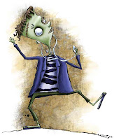
Here’s a little guy I just painted this afternoon. I did a version of him earlier that was a take on the iPod commercials and was originally posted on The Rots blog.

Hiking the Laurel Highlands

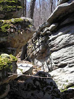
Went for an absolutely gorgeous walk on the Laurel Highlands Trail today. I love the spot here where the trail runs in and around a maze of massive boulders. The best way to wind your way out the other side is just following the blazes.

It’s been above freezing for a couple weeks now (and reached 80 degrees this afternoon!), but the area received so much snowfall in February that the spots between the boulders that don’t get much sun are holding onto their last bits of winter.

More illustrations for Jack & Jill

I did a few more spot illustrations for Jack and Jill‘s March/April issue, and I’ll post a couple of them here. The illustrations were part of their Earth Day article that suggested things kids could do to “go green.”

First, they encouraged kids to open a window when the weather was warm enough. I had to play with the “wind” a little bit before I was satisfied. It needed to be transparent enough to show the window behind, but opaque enough to be able to see it in the places where the background was white.

They also encouraged kids to throw their trash away in cans rather than littering.

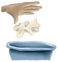
The throwing trash picture wasn’t the only spot where I had to draw hands for this issue. I hung out at the small cafe in our local grocery store one morning and just sat and drew different angles of my hand to give the art director and editors a choice to pick from.

They ended up picking #2.

Cleaver rough sketch

Here’s the sketch I drew for the illustration to go with Cleaver Overachiever. Again, I’ll finish it with graphite, and when I’m finished I’ll post it on the illustration extras page of the site.

I’ve made a bunch of splatters with powdered graphite to play around with, and I’ll figure out later which one I like best for the final drawing. The one here is winning so far.

Illustrations for Jack & Jill Magazine

Here are a few more of the illustrations I did for Jack and Jill‘s March/April issue. These ones were spots that were scattered in and around some “how to go green for Earth Day” suggestions.

This first one encouraged kids to ride their bikes to school. I played with that iconic “school zone” street sign showing kids walking to school by adding a bike rider to the mix.

This one explained the importance of turning off the lights when you leave a room. I worked on some of these while I was on an Amtrak train to Philadelphia with my laptop and a 4″x6″ Wacom tablet. The setup worked out surprisingly well.

And this last one suggested bringing your lunch to school in a reusable bag. I just pictured one of those ones with the canvas strap and Velcro closure, and I added a retro 60s flower shape so it could be used by either girls or boys.

Bombs Away drawing before and after

As promised, here’s the first illustration I had to redraw for style consistency. It’s called Bombs Away, and the one on the left was originally published as a greeting card a few years ago. The right one is the redraw.

New business card design

I’ve finally redesigned some new business cards for the graphic design offshoot of my freelance work (the white cards below). I had redesigned my Web site over a couple years ago, but until now I’ve been using the old business cards with all the old fonts and graphics and abrasive attitude (the black card to the right). I guess I thought I could use them up or something. The problem was, I wasn’t handing them out at all. They just weren’t where I was coming from anymore.

That was dumb.

So I’ve updated the new cards with my new branding, and I designed the back of the cards to mimic my Web site’s navigation and portfolio rollover buttons.

And I’m also finally in the position where I can get the cards printed on recycled paper (and did), which satisfies me a great deal.