My figure drawings finally found a home

Remember back in March when I wrote about reacquainting myself with figure drawing? Well, it’s gotten even better since.

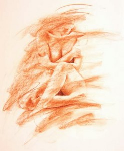
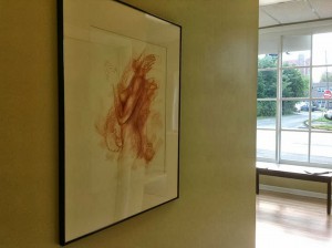
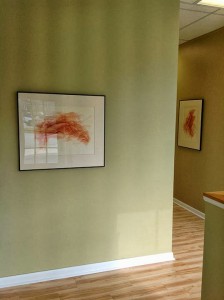
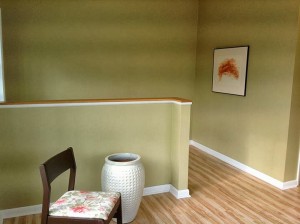
The short version of the story is, a handful of my old figure drawings from ten years ago are now hanging in my gynecologist’s office. Have a look:

The photos above were taken in the waiting room and just back the hallway a little. Another drawing hangs in the next hallway back and a fourth one in a little room off from the waiting area. Two exam rooms each have a drawing as well.

The paint colors my doctor chose for the walls are, first of all amazing, and second, perfect for the off white paper and Sanguine conté colors I used for the drawings. All the walls are painted with muted earth-toney colors, with different colors in different rooms, and the drawings look like they were made for the spots where they were hung.

The plan for now is that we swap the drawings out each year to keep them fresh. Swapping out will also (in theory) give me incentive to get more drawn. For some reason I’m just assuming I’ll be able to jump right back in and still be able to draw the figure. I’m not sure why I assume that.

Here are the ones we’ve hung:
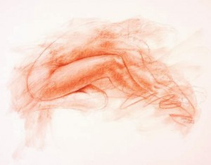
This one is just inside the front door. She’s going to be a hard one to replace later.
She’s the one hanging back that first hallway.
This one is in a little room off from the waiting area.
One of the first figures I drew. She’s back the next hallway.
I called this one “Pretzel” a while back. She’s in the first exam room.
This one is hanging in the second exam room.

We only hung the ladies, and only the ones that might cause the least amount of controversy (as in, for example, nothing full frontal). I have more figure drawings on my fine art website: http://www.norathompson.us. Some of the ladies we didn’t include are there along with some men and the only baby I’ve done so far.

I’m chomping at the bit to draw more, but I have too many things on my plate right now to dig that old paper out and get started. I’m also a little nervous about getting back in the groove. These drawings were all done in a few months’ time, and I was definitely in the zone. But that was ten years ago. I hope I still have them in me.
Branding: Now I have to update everything I own

It was a good idea at the time. Really, it was.

It started with creating a font. That was simple enough. I’ve wanted to design one for so long…

Then the font ended up on my website. Wasn’t that just the coolest thing?

Then I started thinking about how I’ve always wanted the font of my logo to be something I created by hand. Not a problem.

The problem didn’t happen until the reality set in that I was going to have to update absolutely everything in my marketing arsenal.

My new business card

So I ordered new business cards yesterday; I updated my studio invoice with the last commission; I updated the pages that will go into my portfolio, and the file is waiting on a USB drive to take to the printer; the ID stickers I have on my portfolio are updated and waiting to be printed out…Unfortunately, I had a load of postcards printed months ago, and they’re all with the old branding. I’m going to have to use them anyway; I don’t have a lot of choice.

I love the new look, but the new look means a lot more work than just designing a new logo.

It was totally worth it.

Frankenbot

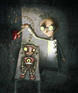
Got a commission for the cover of the fall The Link magazine, the magazine for Carnegie Mellon University Computer Science alumni. The story is about how Comp Sci students don’t just code anymore; they have to build things by hand, too. For example, they build prototypes of the things they are working on like touch screens and robots.

My idea was of creating a robot, Frankenstein-style. I wanted it to have really dramatic lighting, and I wanted to see if I could pull off a colorized pencil drawing. I hope it worked.

My first agent submission

I finally went and did it. My first submission to an agent.

Ever.

You never forget your first.

This also meant I wrote my first query letter, which seems to always want to be spelled “queary” when I type it out. I think it has something to do with the word “queasy,” but I’m not sure.

Oh, and my first synopsis.

(Why do you people keep making me write more words?)

Bones are crossed.

Skydiving School

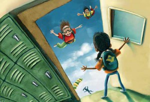
Well, I shuffled off my latest postcard, and it’s already generated a few hits on the site (at least, the timing is right for all the extra hits). Always exciting to see. I’m calling the illustration “Skydiving School” for (I hope) obvious reasons.

The image is over there, on the left, and here’s the page I put together for the people who want to go green and see it electronically: http://www.nora-thompson.com/postcard.html.

A Font is Born

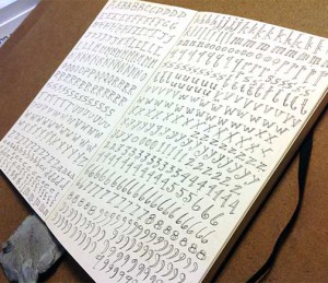
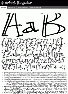
Last year I sketched out the idea for a typeface that I wanted to make into a font (the first photo here). I did it while I was on breaks at work, so it took a while to finish. I’ve kept “Make that typeface into a font already” on my To-Do list for a long, long time.

Well, yesterday was the day.

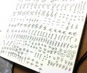
I finished up the punctuation (the second photo here) and uploaded everything to Your Fonts (love those guys), and had my very own font within a matter of minutes.

As a type geek, I can’t begin to tell you the amount of dancing that’s been done in the last 24 hours.

I’ve also uploaded that little guy to Font Squirrel, downloaded their Web Kit, tweaked the CSS on my site so the font fits, and now Quirkish is sitting happily as the headline font there for everybody to see.

Love, love, love type.


Domicile inspiration in Wellsboro

I ran across a photo I took a few months back (O.K. it was nine months ago), and I still love the look of it. This was a house in Wellsboro, Pennsylvania. They have a bunch of old houses that they use as Bed & Breakfasts, but it’s been so long I don’t remember if this is a B&B or somebody’s house. (Sorry if it’s your house. I don’t mean to be creeping.) So many nooks and crannies. So much personality. I’m keeping this filed to use as a starting reference point for an illustration some day.


Girls v. Boys

This bothers me.

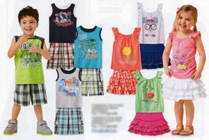
I received an ad in the mail the other day, and was a little disappointed with the back page. That page was for kid’s clothes, and at first glance I doubt most people would see anything wrong with it.

I did.

This is what I’ve had to contend with my entire life. I wanted to go outside and get dirty and play baseball but, since I was a girl, I was expected to be satisfied with skirts and Barbies and waiting to be rescued by somebody’s idea of Prince Charming. It wasn’t my parents so much as the Powers That Be. There were no Little Leagues for girls (or any boy’s ones that would accept us). We had a seventh and eighth grade basketball team for boys, but none for girls, and I wasn’t allowed to play on the boy’s team. I know. The 12-year-old me got up the nerve and asked the coach personally. And you might as well forget about organized football. That’s why they invented cheerleading.

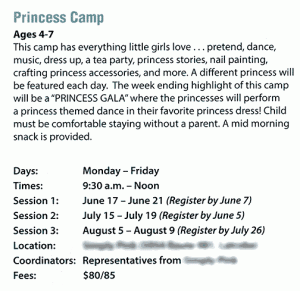
Here’s another gag-me moment I had a couple of months ago: Princess Camp. No joke.

Because, really, what little girl wouldn’t want to be a princess? “This camp has everything little girls love…”

Not really, no.

I wanted to spend my money and time going to Pirates games, not farting around at the mall or playing dress-up. I felt (and feel) like that little girl in the toy store.

Thankfully I’m married to somebody who knows how to show a girl a good time, who buys me the kind of shoes (and boots) I really want (running and hiking) and gives me the remote during the game.

That’s what I’m talking about.

My love letter to Spammers

I seem to be attracting spammers with the update of my website, so I’ve gone through it page by page and separated all my email references from the mailto links that made them so convenient.

Every. Single. Page.

Spammers suck. And, they think I’m stupid.

So, to try to avoid further junk clogging my inbox, I’ve changed every email address from @ to (at) and . to (dot) in the hopes that my future contacts will be living, breathing human beings rather than the internet freeloaders I seem to be attracting. It’s unfortunate, because the people I want on my site won’t have the convenience of messaging me with a simple click of an email link anymore.

My love letter to my most faithful spammers:

Dear Lovely Spammer You,

I’m not interested in your services. If I were, I would have looked you up already. Sorry.

I’m not interested in your selling my email address to your friends as viable and working, and I refuse to open your email alerting you that it is, enticing as the subject line may be. (As an aside, maybe you should find new friends. They’re dragging you down.)

I’m also not interested in waking the virus that you’ve painstakingly taken the time to write and spread. I just don’t have a block of time big enough where I can pencil that in. Sorry you did all that for nothing.

I work for a living. Maybe you should look into it.

Love,
Nora

Baughman Trail hike

Rule #1: Get away from work once in a while to keep the creative juices moving.

Rule #2: See Rule #1.

I guess Adobe didn’t like my business

It’s hard to verbalize the disappointment I’m feeling from yesterday’s announcement from Adobe.

The company has decided that, starting with their latest release in June, their programs (Photoshop, Illustrator, InDesign, Dreamweaver, Acrobat to name a few) will be rent-only. Meaning, you pay the rental fee every month ($49.99 if you pay for an entire year up front), and as soon as you stop paying, the program goes bye-bye. No more holding on to your old physical version for a couple of years because you can’t afford to buy the new one just yet.

So those of us who make too little money in our freelance designer and illustrator jobs already, who go broke splurging for the latest Creative Suite package when ours has aged so ripely for two years? We are the ones who will be left in the dust.

Ashes to ashes, I suppose.

I’ve spent money on Adobe products for years. I bought them separately before they were packaged in a “Creative Suite.” I bought them when they were Aldus and Macromedia. I bought CS1, CS3, CS5 and, last December, CS6. On all my sites I’ve added a colophon singing the praises of the Adobe products I love and use so much.

CS6 will be my last software purchase from the Adobe line.

I’m not a developer. Coding is still a relatively foreign language to a designer. This morning I started my search for alternative WYSIWYG HTML editors to replace the Dreamweaver that made my website designing so much easier.

I think I’ll leave the colophons on my sites, but add a strikethrough over the Adobe titles until I’ve found, purchased, learned and begin using alternatives.

Adios, Adobe amigos. You used to be very good to me.

Twisted: Vol. 2

Hey. Guess what.

I went and drew something new for Twisted: Tales to Rot Your Brain Vol. 2, and here it is:

It felt good getting back into it. I’ve been busy writing a novel for over a year now, and any kind of writing or illustrating for Twisted has taken a bit of a backseat. This illustration is page 7 of a graphic novel I had started for the first volume that didn’t quite get finished in time so it got pushed aside until a later date.

You can see other pages from the story on the Hairy Eyeballs illustrations page.