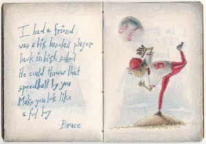
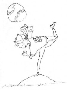
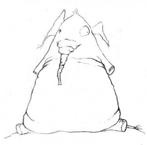
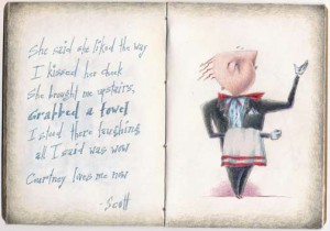
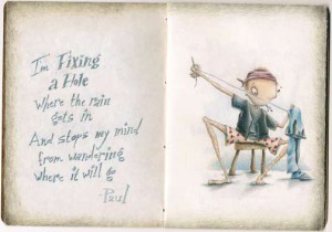
And here’s that little baseball player dude in color (for the Sketchbook Project 2012 sketchbook). He’s wearing red and white, of course, because those were my high school‘s colors.
Sketchbook Project 2012—Baseball sketch #sketchbookproject
Here’s my next sketch in my Sketchbook Project sketchbook. He’s a baseball player (duh). I wasn’t sure at first if I should put a name on his back or not. I’ve sort of decided he plays for a high school team, so I’m going to leave the name off.
Contest entering
I spent a lot of time this month preparing books to be sent out for writer’s contests, and I still don’t know. Should I be doing that? Does the starburst stickers on the covers of books really make people want to buy them more? And is that what it should even be about? The groups giving out the awards kind of market their award along the lines of “win our award and get yourself noticed.” Any stickers that got stuck would be limited to the ones I stick on the books myself anyway, so I’ll just go with the “hey, I can tell everybody I won an award” justification.
I’m probably second guessing the whole awards thing because of past experience with juried art exhibits. It’s all a crap shoot. In juried art shows, the jury—or rather the juror (they are usually only one person)—may or may not like the kind of art you do. They may or may not have a sense of humor. They may or may not have had their coffee that morning. They may or may not have had a full night’s sleep the night before jurying the show you’ve spent good money to submit your best piece to (that you’ve labored over in both creating and choosing to submit). But mostly they might just like a certain kind of work, and if that’s the kind of work you do, you’re in. If it’s not, better luck next time. And then, once you get in, the possibility of actually winning an award is pretty slim. So, yeah, a crap shoot. One person’s opinion.
I’m thinking I’ll have a go at the writer’s contests this year, and if it feels like it’s been a total waste of time (and it has taken a lot of time), I can always skip it the next go ’round.
I did a lot of research trying to figure out which awards might be worth entering, and here’s the list of the ones I finally submitted to:
- Golden Kite Award: This one is given out by the Society of Children’s Book Writers and Illustrators, and is one of the more prestigious awards a writer (or illustrator) can get. The awards are geared specifically toward kid’s books (obviously).
- Purple Dragonfly Book Award: This award is given out by Five Star Publications. What I liked about this one was that they give you the actual criteria sheet that the judge will be using to rate your book. It’s good to know exactly what they’re looking for. This award is also specifically for kid’s books. I entered two categories with this one: Fiction: Collection of Short Stories and Best Interior Design.
- Writer’s Digest Self-Published Book Awards: Given out by Writer’s Digest. I entered the Middle-Grade/Young Adult books category.
- Next Generation Indie Book Awards: Given by the Independent Book Publishing Professionals Group. I entered two categories: Children’s Juvenile Fiction and Best Overall Design.
The dates the awards are announced vary, but they’re all still at least a few months away. So now, all that’s left to do is wait. And keep writing more.
I can’t scream this loud enough: “I’M PROUD OF JACK GANTOS!!!”
O.K. Well. There you go.
A little background, shall we?
I was working afternoon shift in Greensburg, Pennsylvania (noon-8 pm) quite a number of years ago, when I ran across some announcement somewhere that a kid’s writer would be giving a free talk at our local college where I happened to be enrolled as a student. He was there to talk to the Masters in Writing Popular Fiction students, but the talk was free and open to the public.
I left work early that evening. Shh. Please don’t tell.
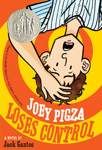
The writer was someone I had never heard of (yet), but he came with some accolades, including a Newbery Honor for a book titled Joey Pigza Loses Control. At the time I wasn’t a big reader of kid’s books, and I was clueless as to who this guy was, let’s just be honest.
The writer, of course, was Jack Gantos, and he turned out to be an absolutely amazing story teller. He wore a mic on his shirt throughout our little talk, displayed his writing (and, apparently, doodling) journals on a large screen behind the stage he was romping over and didn’t stand still for one tiny minute. Turns out, he was a local boy. Born in Mount Pleasant, PA (me, too), grew up in Norvelt (until he was seven) and his mother still lived in Greensburg and just happened to be sitting right next to me.
***As an aside, I visit my dad every other Sunday, and Mount Pleasant and Norvelt are two small towns that happen to be part of the drive between my house and his.***
Let’s just say Jack Gantos left an impression on me that evening that I’ll probably never forget.
Fast forward to last Monday.
Every year the American Library Association awards some very prestigious honors for kid’s books, with the two highest prizes being The John Newbery Medal and the Randolph Caldecott Medal. The Newbery goes to a writer and the Caldecott goes to an illustrator, and both are considered the highest awards that can be won by a writer or illustrator in the United States. Runners-up get Newbery or Caldecott Honors.
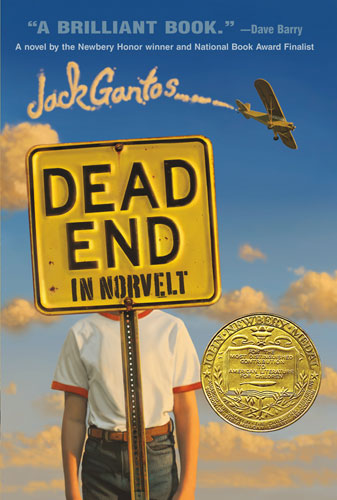
Last Monday the ALA announced the Newbery winners, and this time, Jack Gantos went home with the top prize for a book he wrote titled, Dead End in Norvelt. It’s historical fiction about our very own little town of Norvelt. It’s terribly fun to read by someone who recognizes the places and history that he mentions in the book: Frick Hospital (where I was born and where the one and only wall mural I’ve ever painted is located—please don’t tell anyone, it’s a really embarrassing piece of work), Mount Pleasant, Kecksburg (and the “UFO” landing there), Hecla (which is so small, it’s hard to find a link to the right one), and the list goes on.
I got all teary-eyed when I’d heard that he had won, but adding to that that the book he won for was about my little corner of Southwestern Pennsylvania just made my day. And my month. I’m feeling a little pride for one of our own making it—and where he came from—big.
If you ever have the chance to see Jack Gantos speak publicly, don’t hesitate for one second. You have to go. Trust me.
Author pages on Goodreads and Amazon
I’m learning, I’m learning.
Everything I’m learning about one thing as a publisher leads me off onto another island of things I need to learn about and do which ends up scooting my raft off onto the next island.
Somewhere in the middle of all this Twisted book stuff, I was able to put together a couple of author pages on Goodreads and Amazon. I’m still learning what I need to do to get everything up to speed, but slowly it’s happening.
If you’re on Goodreads, give me a shout. A review or rating would be excellent. I’ll make you a deal: if you let me know that you would like to review the Twisted book on Goodreads, I’ll send you a copy for free to review.
Yep. Free.
That’s as good as it gets short of cupcakes.
As for the author pages…
Goodreads: http://www.goodreads.com/norathompson
Amazon: http://www.amazon.com/author/norathompson
Business cards for the…business
Over the last couple of weeks I’ve been working my tail off getting books out to reviewers and submitting for awards. One of the reviewers I sent to (Midwest Book Review) requires a press kit along with their review copies, so I had to back up a little and work on all that in the middle of a ton of mailings.
Let’s just say I’ve been getting a lot of designing done for Hairy Eyeballs Press lately.
For the record, the logo was one I drew by hand. I thought with a name like “Hairy Eyeballs Press”, I really needed a hand-drawn logo. It just felt right.
And most importantly of all, I had the cards printed on recycled stock from GotPrint. That’s one of the things I’ve been slowly integrating into my business practices, and I’ll write more about that in a later post. Too much to include right now.
So. Business cards. One more step toward migrating toward legitimacy for a little business I thought would be a good idea to call “Hairy Eyeballs Press”.
Books out for review
While I was trying to find contact information to send out books to local libraries, I started seeing a pattern of replies: some of the bigger libraries want to see book reviews from major sources before they’re willing to stock your book in their library. So I guess I need to back up the truck a little. In researching reviewers, I’m finding some of those major sources cost some major money, so I had to do a little sifting to figure out how much a review was worth from which reviewers.
I’ve spent the last few weeks getting everything together to send copies of the book out to the reviewers I’ve narrowed the list down to. Different review places want different things, and that meant I had to not only write what they were looking for (media kit information), but I had to design some stuff, too (Hairy Eyeballs Press letterhead and business cards). It’s a a wee bit time consuming, but I guess that’s what you’re in for when you’re a one-person operation.
[the places I sent to…]Publishers Weekly—I think PW will be a bit of a stretch if I can get a review out of them. The first thing you have to do is register your book in their quarterly supplement (it costs money). Then, if the stars align for you, you could be one of the 25 or so books that PW picks for review. Twisted will be listed in their March supplement and, if it gets reviewed, that review will print in the same supplement. I would say, “Don’t hold your breath,” but I’m holding mine, so who am I to stop you?
American Library Association—ALA doesn’t charge anything for a review, but it’s looking like your chances of them picking your book to review are pretty slim. Their site says they get more than 60,000 submissions each year. Ouch.
Midwest Book Review—Midwest Book Review might be a little more promising when it comes to getting picked for review. I’m not really sure why I feel that way because right on their site they say only half of the books submitted make it to final review for various reasons, and they receive 50 book submissions each day (I did the math for you: that’s 18,250 submissions a year. Unless it’s a leap year which, of course, this is, and then it would be 18,300). I guess I feel a little hopeful because they give special preference to self-published books.
I’m keeping Kirkus in my back pocket for now. They’ll do your review for you, but it will cost you $425. I’m not sure if I can justify or afford the cost right now. Maybe if I sell a few more books on Amazon? Maybe some more people could write a review on Barnes & Noble? Maybe you can tell your friends? Your family? The person sitting beside you on the bus?
In the meantime, I’ll be watching to see if I get any reviews from the ones I sent.
Crossing them fingers.
Sketchbook Project 2012—Harley in color #sketchbookproject
O.K. Admittedly I’m running a bit on the late side with this one. I signed up for the Sketchbook Project 2012 months (and months) ago but, unlike the usual get-it-finished-way-before-it’s-due me, I’m getting the color done on these pages way too last minute for my blood pressure (it’s due Jan. 31). I would include the link for the project, but right now they’re signing people up for the Sketchbook Project Limited Edition, and I can’t find a link anymore for the regular Sketchbook Project 2012.
So here you go. The first color page (after the cover and title page, of course) finished and stamped with “done”. I posted the sketch for this little guy last August. Apparently, at the time I named him Harley so I guess we’ll have to go with that.
Say “hello” to Harley.
Book plates for the libraries
In my last post here (two weeks ago—I know), I told you about how I set up a form on the Hairy Eyeballs site where you could request a free book for your local public library.
Well, things haven’t exactly gone as planned (as if they ever do)…
About five days after that post I totally migrated all my sites, emails and domain names out of GoDaddy’s life. Lots of work. Lots of nail-biting. Lots of “Yay! I did it!” I’ll have to tell you about that at a later date. All you need to know right now is that the form I sent you to in the last post? Yeah. That’s not working at the moment. It looks like I’m going to have to do a little coaxing for that to happen, so don’t expect anything out of that form until further notice.
What I was able to accomplish over the last couple of weeks was get the books that were already requested ready to ship out. I designed a book plate for inside the front cover of each book showing what library the book was donated to and who requested the donation.
And here it is, all fancy-shmancy like:
