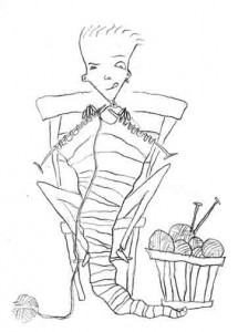
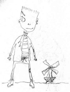
The sketch for the next page of my Sketchbook Project project: a knitter.
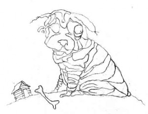
Sketchbook Project 2012—Wrinkly dog in color #sketchbookproject
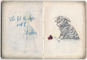 Here you go. The wrinkly dog in color.
The further I get in the sketchbook, the heavier I seem to be applying the spray fixative. I started out worried about when I was working on the back of a page, how the page on the other side would rub and transfer to the page opposite it. So I’ve been laying on the fixative. Unfortunately, that seems to be messing with the transparency of the paper, so on this page you can see the Frankenstein showing through from the page before.
Not only that, I’m noticing that any green I use bleeds through the paper as yellow on the other side when I spray it.
I don’t think there’s much I can do about all that, so I’m moving on with the rest.
Damn the torpedoes.
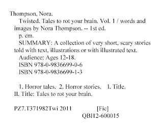
Publisher’s Catalog in Publication—Got it!
It looks like the book is a little more official now.
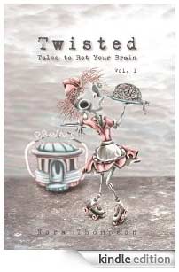
Quality Books created a Publisher’s Catalog in Publication for Twisted: Tales to Rot Your Brain Vol. 1, and it’s now printed on the copyright page of both the hard cover and paperback editions of the book. There was a brief burp while the new text files were uploaded to the printer, but that’s all finished and both editions are back in stock. And looking pretty official.
A Catalog-In-Publication is usually given out by the Library of Congress, but they’re not really interested in working with publishers who aren’t yet “established” (meaning they have published less than three books). But it’s not like somebody else can’t do the work for you.
The Catalog in Publication is there to help the librarian catalog your book. That’s it. Here’s how The Donohue Group (another PCIP vendor) describes it:
“PCIP gives librarians all the information they need to quickly add a record for the book to their database or card catalog. This means improved service to library users (and happy librarians).”
So if you know somebody who knows what all the CIP symbology is about (like a really cool librarian), they could make one for you, if you ask them nice. Otherwise, there are companies that provide the service online for a fee. I think just having happy librarians around makes it worth it.
My illustrations are heading to Italy! #BolognaBookFair
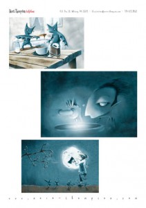
At the end of January I submitted a page of my illustrations for possible inclusion in the SCBWI portfolio at the Bologna Book Fair, and this would be the page I submitted.
The portfolio selection team notified me that my page was chosen to be included (yay!). Not only will it be in a physical portfolio at the book fair, but it will also be included on their site. Once my image becomes available (along with the rest of the portfolio), they will send me a link to it which I’ll post here.
Here was how they described what they’re doing:
“A portfolio of SCBWI illustrator members work will be on display at the SCBWI Showcase during the 2012 Bologna Book Fair and available for browsing by publishers, agents and other attendees from across the world. In addition, a digital version of the portfolio will be posted on this webpage with thumbnails of artwork and contact information as we did for our 2010 Illustrators’ Gallery.”
The fair will run March 19-22 this year.
Lake Benton Public Library, Minnesota
One of the libraries I sent a free copy of Twisted: Tales to Rot Your Brain Vol. 1 to was in Lake Benton, Minnesota. Lake Benton is a really small town, but they can still claim an Opera House (the first image below would be it) and a barber shop. The library even wrote about receiving the book in their newsletter, and they were kind enough to send me a thank you note (hand written, of course). That doesn’t happen so often these days (and really, they were the only library that did).

So thank you, Lake Benton Public Library, and if another volume of this book ever hits the shelves, watch for your copy in the mail soon after!
(And special thanks to Eileen Stephenson for taking the Lake Benton photos right in the middle of a Minnesota winter and getting them safely to my inbox.)
The argument against working on spec (or, Why it feels like my idea was stolen) #nospec
Way back on April 6, 2007, I received an email from a publisher that I won’t mention the name of here. I thought I finally got a bite after all those postcards I had been sending out. Here was what she wrote:
“Thank you for your interest in working with [us].
We have several projects that we feel match your talent and are interested in knowing if you are still available to illustrate picture books.
[Our] process is simply (sic). We ask that you create a rough cover and one inside spread from the text we provide. From your work we will select an illustrator based on who we feel has the best conveyance of text through art and understanding of appeal in the children’s genre.”I ran the proposal past some of my colleagues in the Pittsburgh Society of Illustrators, and I got advice that went both ways. I reasoned that even if I didn’t get picked I could still finish the image and use it for my own self-promotion (yet another postcard).
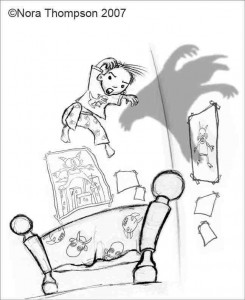
So I did. Here’s the sketch I did for the cover.
This was the exact file I sent in (on April 18), with my name and copyright really noticeable right there at the top.
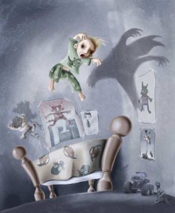
And this was how the image looked after I finished it. To be fair, I didn’t actually email the publisher the final image, so the argument could be made that they never saw it.
The editor/publisher replied that if I didn’t hear from her by that Friday, then she would get back to me when she got back from the Bologna Book Fair. When I hadn’t heard anything by May 11, I sent an email to find out what was going on, and she said she was “still digging out from business travels, but promise to get back to you.”
O.K. I guess I needed a little patience.
On September 17 I sent another email asking for the status of my submission, and that’s when I found out they weren’t interested in my idea.
This evening I was doing some updating of my mailing list, and I was checking out that publisher’s site to see if I should keep sending to them (no, I hadn’t removed them from my list yet) when I found this.
Yes, stylistically my image and the one here are very different. But nowhere in the manuscript was there any mention of the boy casting the shadow of a monster in his bedroom. Is that so obvious of an idea that somebody else actually thought of it after I did? And if this illustrator and I both sent in the same idea, wouldn’t you as an editor/publisher want to go in a direction that wasn’t so obvious?
As an aside, when I first found out that they didn’t want me to illustrate the book, I kept watching for the book on their site to see what they had picked instead. In the beginning, there was another image on the cover that I can’t seem to find on the Internet. It was a computer-generated image of a purple monster standing at the foot of a bed. The monster was in the middle of the frame, looking directly at the viewer as if the viewer was in the bed. The image above isn’t the original image I saw online.
I know the illustration on the final book cover isn’t taken verbatim from my idea (especially having seen what other companies have tried to get away with in swiping artwork for their designs), but knowing that the editor saw my rough and seeing the similarities in the final cover image, my post Bedtime Monster anti-spec policy has been firmly cemented.
Just say no.
P.S. I’ve now removed them from my mailing list.
The @arthouse Coop have (has?) digitized my #sketchbookproject
Part of the payback for creating a sketchbook for the Art House Coop (The Brooklyn Art Library) is that they scan every page of your sketchbook and upload them for the whole world to see. They’ve finished scanning all of my pages, and here’s the link to the digitized version:
http://www.arthousecoop.com/library/6123
If you’re unfamiliar with the Sketchbook Project, here’s a post that attempts to explain what it’s all about:
http://nora-thompson.blogspot.com/2011/12/sketchbook-project-2012.html
And here’s a ready-made search of all my posts of sketches and finished pages for the project:
http://nora-thompson.blogspot.com/search/label/sketchbook%20project
This was the Sketchbook Project 2012 version. They’ve just finished signing up participants for the first round of the Sketchbook Project Limited Edition, and I went and signed up for that one, too. I’ll be posting about the Limited Edition project on The Rots’ blog, so I’ll be posting the progress on that sketchbook over there.
ePubs and ebooks and mobis
Over the past couple of months I’ve been teaching myself the ePub thing in Adobe InDesign CS5.5 (a Christmas present from my lovely husband), which wasn’t so hard except when you have images that kind of have to be where they are, the way they are. Figured it out, sort of. It just got to the point where I had to decide how much I was willing to give up in exchange for my sanity.
The short version of this is, after much wailing and gnashing of teeth Twisted: Tales to Rot Your Brain Vol. 1 is now available for immediate download on your Kindle! Yay!
I’ve checked and double-checked and triple-quadruple checked to make sure this thing works on Kindle, Kindle Fire, Kindle for iPhone and Kindle for iPad. No small feat.
Next victim: the Nook at Barnes & Noble!
As an aside, I just noticed the URL for the book uses the phrase “Twisted-Tales-Your-Brain.” I wonder if the “Rot” in the middle of that was too offensive for them.
Cool.
Sketchbook Project 2012—Frankenstein in color #sketchbookproject
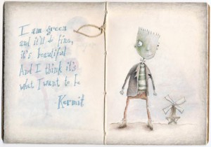
Here’s the finished Frankenstein page of my Sketchbook Project. This is the center spread, so what you’re seeing down the middle is the tied-off end of the string from where I bound the book.
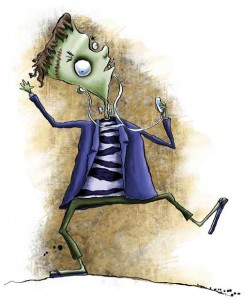 |
| Another green Frank. |
The only reason I can think of that my Frankensteins are green is because Herman had a bit of a greenish tint to him when The Munsters were in color. I used to be a big Munsters fan when I was little.
Reviewed at the Madhouse #twistedtales
Sending out a special “thanks” to Stephanie Wytovich for her review of Twisted in her latest post in the Madhouse. It warms my cockles when somebody gets it:
http://joinmeinthemadhouse.blogspot.com/2012/02/featured-author-in-madhouse-nora.html
“…it fuses the worlds of literature and art together in such a macabre fashion where it’s suitable for kids, but still really creepy and entertaining for adults.”
If you (or someone you know) are interested in reviewing the book, send me an email, and we can have ourselves a little talk.
Sketchbook Project 2012—Frankenstein sketch #sketchbookproject
Here’s the next page in my Sketchbook Project for the Art House Co-op and the Brooklyn Art Library. This illustration marks the center spread which means he’s also standing on the halfway-through-the-sketchbook page.
If you missed what this little project is all about, here’s the post that explains all the details.
