Stop it! Just stop it!
http://www.good.is/post/good-design-daily-do-you-double-space-after-periods/
 |
| fig. 1 |
For those of us (meaning: you) who don’t know yet, back in the day when we (meaning: us old people) were learning to type, we were learning on that antiquated mechanism called a “typewriter” (see fig. 1).
Typewriters used monotype lettering, meaning, no matter what the letter, every single letter took up the same amount of space. So an ittie bittie lowercase “i” needed to be just as wide as a monstrous capital letter “M” (see fig. 2).
 |
| fig. 2 |
So that the periods at the end of the sentence stood out a little easier before the beginning of the next sentence, we learned to put an extra space after the period. I guess the idea was that it was too hard to distinguish where one sentence ended and the next one began, so we gave that little period a place to breathe.
What happened then was computers. Computers started getting smart. Not only were they able to use type that wasn’t hampered by physical limitations, but they also knew how to give each letter the spacing it needed for optimal reading. They didn’t need us to tell them about the extra spaces we had been using after a period. It already knew how much was necessary and said in a condescending kind of way, “Yes. I know.”
Problem was, the people who learned how to type on typewriters (meaning: us old people) kept teaching new typists (meaning: those of you who grew up learning to type on a computer keyboard) that double-spaces after periods were the way it was done, mainly because we didn’t know any better.
 |
| fig. 3 Typographers should avert their eyes from ¶ 1 |
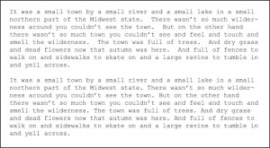
But now we do, so stop it. It isn’t necessary, and it causes empty spaces to stick out through your text when you do it that way (see fig. 3). A block of text should have an overall gray tone, but those extra spaces break that overall gray up in a way that gives typographers the hives.
If you want to fight this change to the death, here’s a few good lines taken from the link above:
Using a single space means that you understand that technology has changed since the decades ago when you first used to type. A single space means you realize not everything your teachers taught you in high school still holds true. A single space means you have respect for the journalists and designers who are working hard to take those extra spaces out of the drafts you’re sending us.
And who wouldn’t want to show their high school teachers that they know better?