 Well. It’s been a long time coming.
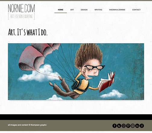
For years now I’ve had separate sites for my kid’s illustrations, fine art and graphic design along with even more sites for my Twisted and Stranger Man books—and blogs for everything. Needless to say, I was overwhelming myself. Now, finally, I’ve started gathering my sites under one roof. The site that will cover everything can be found here:
nornie.com
Nornie was the nickname my dad gave me when I was very young, and it never went away, even after the day I threw a fit and argued against it. I lost that fight before it ever started.
I haven’t moved my Twisted and Stranger Man sites yet, but I have already moved my illustrations and fine art to their new location. (For those of you in the know, I had already revamped The Rots site, keeping with the same layout as my nornie site, but swapping out the main gold-ish color for teal.) I’ve redirected my old domain names to nornie.com (and the appropriate pages), but I doubt I will trash those old domains anytime soon. I’ll also be making new business cards with the nornie.com logo on the front, but I’ll get a couple of different versions printed, one with a fine art image on the back and the other with an illustration. The new site is responsive, which I needed, and I’ll have the option to add an online store if I ever decide to do so in the future.
My biggest concern is that I will confuse people as to where they are (You really are in the right place! Really!), but I’m hoping with new business cards and new postcards to send out (maybe even announcing the switch) I won’t lose too many people.
There’s a screen shot up above there of the front page. Lots and lots of work went into this, and I have to say, I’m pretty satisfied with the outcome.