Let’s set the stage here. I’ve been receiving a lot of feedback about my illustration portfolio, mostly in that it will likely scare the children. (As an aside, I’m in the process of completely overhauling the lot of it to eliminate those things that I’ve been told make it scary.)
The other day I went shopping at Barnes & Noble. I had a 20% off coupon. It was mandatory.
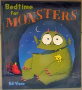
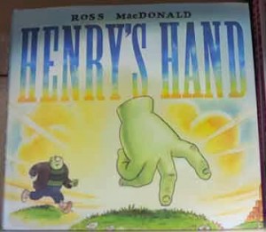
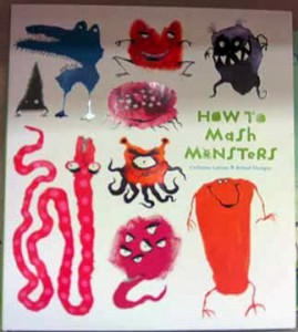
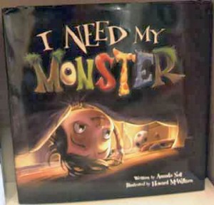
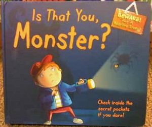
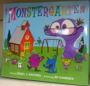
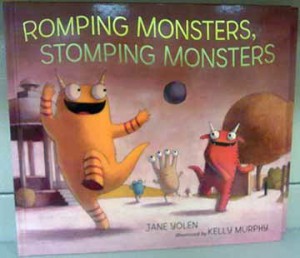
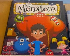
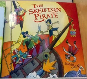
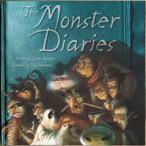
I saw a bit of a trend in the picture book department, and I decided to take a few photos. See if you see a pattern.
And I bought this one (isn’t the lighting on the cover fantastic?):
For the record, Halloween is very much over, and the Christmas books were everywhere. Most of the books (all but two, if I remember correctly) were face forward rather than lined on the shelves.
I have to say, I had a discussion with a children’s book editor over the weekend (who I won’t identify here) who, when I told her most of the feedback I’ve been getting about my portfolio is that it’s too scary, said, “Creepy is in.”
I totally love that editor.
