#WPaSCBWI 2010 Fall Conference

One week from today—save the date.

The Western Pennsylvania chapter of the Society of Children’s Book Writers and Illustrators will be hosting their annual conference at the Greentree Radisson in Pittsburgh next weekend, and I’ll be speaking about social networking.

First, the info:

Friday, November 12
Pre-Conference Event
(You must also attend the conference)
7pm–10pm
Reception and cash bar followed by informal round-table critiquing.
Bring a 5-page manuscript to read aloud.
Saturday, November 13
Conference
8am–5:30pm

Faculty include:

Second, the details:

I’ll be leading two workshops titled Social Networking—I Don’t Wanna! The first one (session B-2) from 11:30-12:15 will be geared toward a general audience, mostly writers. The second one (session C-4) is scheduled for 3:15-4:00 and will be geared toward illustrators, but I will also accommodate anyone who may have missed the first session.

I have the presentation set up to answer attendee-specific questions including:

  1. Why do I have to social network?
  2. Where do I start?
  3. What do I say?
  4. When am I supposed to do this?
  5. How do I get it right?

I’ll also include tips on how to use social media creatively along with listings of online tools and sites to get you started. I’ve started a new blog that I’ll be using throughout the conference (technology permitting) with info and tips from the speakers. I’ll also be tweeting images on twitter, with the search hashtag: #WPaSCBWI.

Once I get the presentation finished, I will upload it here:
http://www.nora-thompson.com/wpascbwi.html

B&W Becca

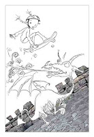
I finished the black and white “Becca” illustration for the back of my latest postcard, and here she is. The color version for the front of the postcard can be seen in the last blog post.

New kid’s illustration preview

As promised, here’s the finished version of “Becca,” the sketch for which I included in my previous post.

The biggest change from the sketch was curving the top of the castle wall. I think it gave it a little more of a disorienting kind of edge.

Another small change was with the dragon’s tail. His name is Draco, first of all. And he isn’t as tough as he tries to make himself out to be. (I’ve sketched out the image that will be going on the back of the postcard which will explain what I mean. You’ll have to check back in a few days to see that one when it’s finished.) As for the tail; I changed it. No biggie.

O.K. Fine. I’m back.

After a brief four-month-or-so hiatus, I found the encouragement I needed to keep plugging (thanks to Cliff Knecht and Cricket A.D. Karen Kohn). So I’m back, and I’ve got some work to do.

First up, I have a postcard to get painted and mailed, and I’ve uploaded the sketch for it to the right over there. The girl’s name is Becca. When I get the color version finished, I’ll post it here.

Matthew Carter a 2010 MacArthur Fellow

Here’s a guy you have likely been reading for years and didn’t even know it. Read about Matthew Carter’s becoming a $500,000 MacArthur Fellow here. Carter has been designing typefaces for something like 50 years, and he worked as a punchcutter when first starting out, and later kept right up with technology by designing faces digitally.

You know that tiny type they use in the phone book? Take a look. It would look kind of funky if you used it as a regular face or big for display type because it was designed for a different purpose. The ink on the presses would fill in the counters of the letters (the spaces inside letters like the lowercase “e”), especially on absorbent paper like they use for phone books. Carter created extra pointy spaces in the counters to allow the ink to spread and still be readable.

And you know Microsoft’s Verdana and Georgia? Yep. Carter’s. Designed to be legible, even at small sizes on computer screens. He also designed Tahoma.

Carter was featured in the full-length film Helvetica where he explained the theory behind his job. He wants you to read and not take any notice the font carrying the message. If you do that, then he believes he’s done his job well. So you’ve probably read his work your entire life, but never even noticed.

Mega storm damage

And on last day of summer.

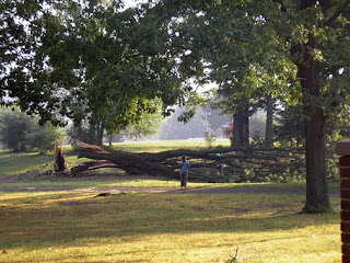
Some neighbors lost some huge trees from the storm that rolled through late yesterday afternoon. I happened to catch this lady taking photos of the damage this morning. Sad part is, they had had a beautiful tree-lined driveway and removed most of those trees last year (you can still see one of the stumps still there). They had all been huge like this one.

Another tree covered the entire road and took a powerline with it.

Sasauge Muffing

Don’t quit your day job.

1. A “sasauge” is not the same as a “sausage” in this part of the country, as far as I know.

2. I guess you need to reverse the number “1” to accommodate all the dyslexic customers? O.K. I understand.

3. (My personal #1 grammatical pet peeve:) Everyday is usually an adjective and means “common” or “usual.” Maybe your “Everyday Menu” or your “Everyday Sausage.” But if you mean the $1 deal happens “every single day,” please, please use two words.

Stepping down from soap box. Please, carry on.

Uh, yeah that’s a snake

So I grew up in the country surrounded by woods, and we had snakes. I never really got used to that. I live a little less in the country now, in a spot that is being surrounded by development. Little by little, the natural habitat of the animals that live around us is being taken away.

We’ve always allowed our property to grow as wild as possible, first for privacy and second for wildlife. We’ve encountered opposum, ground hogs, raccoon, deer, squirrels, chipmunks, a weasel, (possibly) a black bear and many, many species of birds. But until this summer we had never seen a snake.

I guess it was only a matter of time.

I didn’t see or get a shot of the bigger garter snake we had had on our property earlier this summer, but I’m thinking that one might have been a mom. The one I did see and get shots of was just a little guy, sunning himself on the concrete around our outdoor building. He let me take the close-up above which makes him look bigger than he really was. The photo below gives a better comparison. He was only about as big around as a pencil.

And, as was tradition when I was growing up, his name is Charlie.

R.I.P. Glenn Pavone

I was saddened and sorry over the weekend to hear the news of Glenn Pavone’s passing. For those of you who aren’t familiar with Pittsburgh music, Glenn was probably the best guitarist many of us had ever heard in the area.

No exaggeration.

I once saw him tuning his guitar in the middle of a solo. On that same night, I saw him placing an order with a waitress while in the middle of another solo. He was the kind of guy who made it look easy.

The picture I’ve included here was one I took in 1994, somewhere around the time The Cyclones had released their first album, Twist This.

To get an idea of what he was capable of, take a listen:

Mr. Pavone was 52 and will be sorely missed.

Convoluted painting

I finished a new painting a few weeks ago, and I wasn’t all that satisfied with how it turned out at first. But I put it aside, and now that I’m looking at it with fresh eyes, I think I can deal with it. It’s called “Drop Away,” and I painted it with acrylic and mixed media on canvas, 36″x24″. The story behind what it means is the most convoluted of any of the paintings I’ve done for the series so far, which would explain why the painting itself is the most convoluted of any of the paintings I’ve done for the series so far.