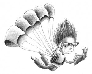
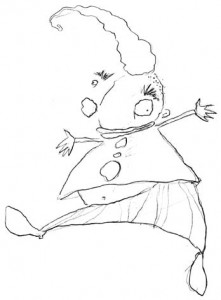
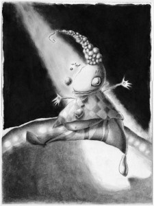
You know what? I’m still proud of this drawing.
I submitted this and a few other drawings to a certain industry newsletter (I won’t mention names) over a year ago, and I’m getting the impression they aren’t interested. I found all those submissions lying around recently and realized I’m a little proud of the work. I think she’s cute, and I think she wants to be seen.
So here she is. Her name is Paula, and she’s really into books.
Like I said, NO SPEC!
So as I’ve posted a couple of times before here and here, spec work for designers and artists shouldn’t even be something we’re discussing now that we have minimum wage and the robber barons have long since disappeared and all. For those people who still aren’t “getting” what the problem is, here’s a little video I ran across that might explain it better:
Won: Two Purple Dragonflies!
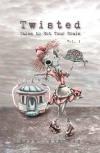
Twisted: Tales to Rot Your Brain Vol. 1 is the proud recipient of two Purple Dragonfly Book Awards! The first one is a First Place award for Fiction: Collection of Short Stories, and the second is a Second Place award for Interior Design. Here’s a link to all the winners:
http://www.fivestarpublications.com/bookcontest/book-award-winners.html#2012pdbawin
The Kirkus review is out!
My book Twisted: Tales to Rot Your Brain Vol. 1 got reviewed by Kirkus Reviews!
http://www.kirkusreviews.com/book-reviews/nora-thompson/twisted-xobcEFVd/
Some highlights:
“A clever collection of stories and comics by debut author Thompson.
An experienced illustrator and graphic designer, Thompson organizes this flash-fiction book into 28 extremely brief chapters on many subjects and uses both text and spacing to heighten interest. Her artwork tends toward the gory, though the drawings also contain elements of humor. The words themselves are arranged on the page for an atypical and interesting reading experience…Thompson shines at using unexpected or multiple perspectives to breathe new life into conventional tales, with story endings that are surprising and skillfully foreshadowed. This balance between the unpredictable and the expected rewards rereading. Thompson uses amusing chapter titles like “Cleaver Over-Achiever” and “Lobotomy Pie,” and her phrasing is often similarly adroit…
An assortment of repulsive yet funny chapters makes for a quick and enjoyable read.”
Although I’m not sure about reporting that my artwork “tends toward the gory,” I’ll take it. Alfred Hitchcock banked his career on people seeing things that he never had to show, so I think I’m in good company.
Are people seeing what the reviewers are seeing?
Hmmm.
Sometimes I wonder what people out there think they’re reading. Or seeing. When you read, how much of what you see comes from what you yourself are bringing to the reading?
The Twisted book just got reviewed by Kirkus last week (yay yay yay!), and I’m noticing a pattern here. I’m not a horror person, let’s just say that up front. At least, not in the way it’s come to be known. I don’t go for gore. I’m more of a Sixth Sense kind of scary story person. But between the book’s review in Publishers Weekly and now in Kirkus, I’m starting to wonder…
- About myself
- About what people think they’re seeing
- About does it really matter
I’ll get to “1. About myself” later, but first, let’s do 2.
“…the main character is brutally attacked”
“…a jack o’lantern sits mutilated in the foreground…”
“…Her artwork tends toward the gory…”
I don’t want to sound like a writer who just got bad reviews and wants to throw a fit; that’s not the problem at all. I’m totally thankful for the reviews I got. They were positive and encouraging and much appreciated (thank you, MBR, PW and KR).
The thing was, when the Publishers Weekly review came out, I thought it was a single instance of someone who was reading more into the stories than was actually there, and I just let it pass. But with this new Kirkus review, I’m starting to wonder what’s at play here.
Without giving too much away, let me address first the PW quotes. In the first one where “the main character is brutally attacked,” I sort of make a face like, huh? Except for two lines, the main character isn’t even touched by the thing after him, let alone brutally. (By the way, the lines are: “Oily fingers grab at your throat,” and “It reaches through from the back of the open stairs and seizes your ankle.”)
In the second quote, I think the easiest thing to do is show you the illustration. And that would be it, over to the right. If the seeds that are left after gutting a pumpkin to make a jack-o-lantern are considered mutilation, maybe parents should think twice about letting their kids at the gourds this Hallowe’en. Just sayin’.
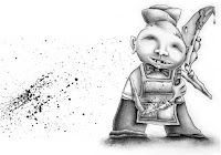
Now to the Kirkus quote, and I think I’ll have to post another illustration here. That picture on the left? That’s as gory as it gets. He’s a butcher. You know, like the one who works in your local supermarket. I’m not even trying to be funny here. I’m a vegetarian, and the poem that goes with this illustration was actually my reaction to just how rediculous the eating of meat (including the kind that will probably be on your dinner table tonight) is to those of us who don’t partake in that sort of thing. Seriously.
Here’s a list (without giving too much away) of the rest of the illustrations in the book:
- clouds (not kidding)
- two birds in a tree talking about the person walking under it
- various poses of an artist drawing a graphic novel
- a clown
- the jack-o-lantern from above
- the butcher from above
- a doctor (not even playing doctor)
- a child’s drawing of a rainbow, a sun, a flower and clouds (those darn clouds again)
- a child in bed sleeping
- the butt of a monster looking in a refrigerator
- a vacuum cleaner
- a kid looking scared in the shadow of a cartoony monster
- another clown (this one’s scary, but not at all gory)
- a chair knocked over with broken glasses and a book
- the zombie waitress on the cover
That’s it.
Now about “1. About myself.” I was worried at first about being categorized in a genre that I really didn’t like and thought I had nothing to do with.
But then I thought about, well, two things.
First, my mentor. Dr. Michael A. Arnzen taught me everything I know about writing fiction. He’s a good teacher, and from what I’ve heard, a good writer as well. Why don’t I know he’s a good writer? Well, because he writes horror, and I really don’t like to read horror. I’ve tried reading his stuff, but it’s not what floats my blood cells, if you know what I mean. But you know what? He’s won enough Bram Stoker Awards to shut up anybody who thinks the genre is all about teen gore movies. Just do a search for “Arnzen” on this page, and you’ll see what I mean.
As for the second thing I thought about: Alfred Hitchcock. So what if these people are seeing something that isn’t there. Alfred Hitchcock banked his career on the possibility that they would, and his is considered classic material.
So I’m not going to worry about any of this after today. If I ever get around to a Vol. 2, I’m going to stick to my guns (but I probably won’t draw any because I’m a pacifist) and draw and write the stories that make me laugh.
And, I’m going to enter the book in the Bram Stokers.
Thumbs up review from Kirkus!
Oooh hoo!
Kirkus Reviews has gone and reviewed my Twisted book, and I’m getting the idea they liked what they saw!
A lot of the review is directed toward book buyers and summarizes some of the stories, but here’s a collection of parts where it’s all about the review:
A clever collection of stories and comics by debut author Thompson.
An experienced illustrator and graphic designer, Thompson organizes this flash-fiction book into 28 extremely brief chapters on many subjects and uses both text and spacing to heighten interest. Her artwork tends toward the gory, though the drawings also contain elements of humor. The words themselves are arranged on the page for an atypical and interesting reading experience…Thompson shines at using unexpected or multiple perspectives to breathe new life into conventional tales, with story endings that are surprising and skillfully foreshadowed. This balance between the unpredictable and the expected rewards rereading. Thompson uses amusing chapter titles like “Cleaver Over-Achiever” and “Lobotomy Pie,” and her phrasing is often similarly adroit…the book is an excellent example of its genre and will likely appeal to younger readers.
An assortment of repulsive yet funny chapters makes for a quick and enjoyable read. —Kirkus Reviews
I don’t think some of the words they use to describe the book are entirely accurate, but I’ll focus on that aspect next week. For now, I’m just going to bask in a repulsively positive review!
In response to VistaPrint (and now 99designs)
Where do I start?
I guess I could start by saying this blog post has been sitting around as a draft since Feb. 6, 2012. I started it, took a few deep breaths and slowly lost the fight in my belly that got me started on it in the first place.
So lets begin there.
I’m sure most everyone has seen the commercials for VistaPrint (I refuse to link to the company here). Who wouldn’t want to bypass the time and effort—and let’s not forget money—it takes to hire one of those elitist graphic designers when you can so easily create your own designs right from the comfort of your own computer (and in your jammies).
For cheap. Let’s not forget that part.
You can make your designs look the way you want. You can pick the colors and fonts and logos yourself. And hopefully you’re pretty good at proofreading, because who wants to pay for 1,000 brochures with embarrassing typos? Because, really, what difference does it make which colors you pick, as long as you like them, right? And as long as the font looks cool, your business will look cool. Anybody can throw a logo together. Geesh. All it takes is one of those fonts that you like, a color that says, “POW” and one of those free stock pieces of clip art. You know, the same clip art all those other people who are using the service can choose from.
You’ll be good to go in no time.
I had a client who I’ve worked with for years ask me to design a sign for their business, which I have done numerous times in the past and have always received an enthusiastic “thank you” for how great I made their business look. I waited for their email reply with size specs, but was punched in the gut when the email instead said, “I decided to use VistaPrint.”
They decided to use VistaPrint.
They were able to create the design themselves online. Not that they had any experience in how that would work. You pay with peanuts, you get monkeys.
Let’s knock some things out of the way up front:
- I went to school, have years of hands-on experience and have taught graphic design at the university level
- Things you learn in graphic design classes:
- Fonts are a whole lot more than fancy lettering; they themselves carry meaning above and beyond the words they spell out
- Colors are a whole lot more than attention grabbers or personal preferences; they themselves carry meaning above and beyond the spaces they’re filling
- Layouts are a whole lot more than making everything fit in a space or taking up every square inch of the space; they direct the reader’s eye and carry meaning above and beyond the content they are arranging
- Yes, we love what we do, that’s why we chose this profession. Isn’t that why you chose yours? Would you expect to show up at work and not get paid for what you do just because you love what you do?
- Your graphic designer knows how to brand your business because she understands your business as well as you do. If you own a business and don’t understand the importance of branding, maybe start with a Google search
- Graphic designers can integrate your brand across all your materials: logos, business cards, marketing materials and websites, to name just a few
- Those logos, business cards, etc. from above? They all require Illustrator, Photoshop, InDesign, Dreamweaver and Acrobat, minimum. The Adobe Creative Suite 6 Design Premium costs $1,899 if you aren’t upgrading, $749 if you’re upgrading from CS5, which I would be if I could afford it. And new upgrades are released every year and a half or so. You do the math
- I was just starting out in graphic design when I hooked up with the client that started this rant and, because I didn’t want to cause their business any undue financial stress, only charged them $15/hour. Yes. $15. (P.S. I’m also still paying off my student loans. Even now.) And yes, that made me one of those people who devalued the work of a designer. When I upped my fee, I priced myself right out of new clients. Rock. Hard place.
Let’s take a step off to the side here for a second…
When someone asks to get work done for free and they get it, they’ll probably expect that work to get done for free again in the future, right? And if you won’t do it for free, surely someone else would love the opportunity. And if enough designers (or artists in general) do the work for free, then why would anybody want to actually pay for that work? And what if someone actually decided, yes, they would pay you for your work with, say, exposure, then you could get paid for some other job at a later date? So if you actually did get that paying job after working on that first job for free, in the end you’ve done two jobs for the price of one. That would be worth the money you spent on all those programs and schooling, wouldn’t it?
Which brings me to today.
I saw a commercial on TV for 99designs.com (again, I’m not linking). They’re a crowdsourcing site where, if you want a design done, you post a contest where you get to pick a winning design from all the free work that gets entered into your contest. Sure, that winning entry gets paid, but those other entries? Yeah, those guys just spent hours (maybe days) of their time and will get no money for it. None. But they’ll have a great design for their portfolio.
Let’s put this in perspective. I want a deck built on my house. I decided to have a contest where contractors can each build me a deck to look at. Not just an idea of a deck, they have to build the actual deck. All those decks will be gathered in one place, and then I get to pick which one I’d like to use and pay for. Those other decks, and all the overhead that went into building them? Yeah. Those contractors can use those in their portfolios. Oh, and by the way, I’ll be paying for the deck by inviting my friends over and telling them who it was that built me the deck. I don’t have many parties, and I don’t have many friends, but what a great opportunity for exposure you’ll be getting, huh.
Is any of this making sense?
Has anybody read this far?
Is there anything that can possibly be done?
Probably not. Maybe. I don’t know, it might be too late.
If you’re a client, pay for the work from a real designer. My husband knows enough about plumbing that he knows somebody else should be doing ours.
If you’re a designer (or artist), don’t work on spec or enter contests. Period. That not only devalues your work but all the work of the designers that have come before you and all the future designers who will be following your ass out of school. Do you really want them getting the job instead of you because they’ll do it for free?
If you want to read more (after this, I’m not sure why anybody would), try:
http://www.no-spec.com/faq/
http://www.specwatch.info/why.html
http://twitter.com/specwatch
Also, you may have already seen my post on yet another problem with working on spec (could there really be more?) in a post from February which I’ll link to here.
I’m going to go ahead and post this one before I take too many deep breaths.
My Twisted book just won two awards!
I just found out yesterday that my book Twisted: Tales to Rot Your Brain Vol. 1 has taken first place in the category of “Fiction: Collection of Short Stories” in the 2012 Purple Dragonfly Book Awards! The interior design layout also won a second place award.
They don’t have the winners listed yet on their site, so I can’t post a link, but once they’re listed, I’ll post.
My book is totally available–with incentives!
It’s taken me a while, but I finally was able to get my book available for purchase on its own site:
http://www.hairyeyeballs.com/books.html
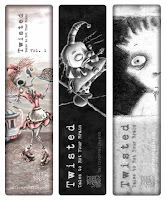
And that’s not all: If you buy the book directly from me (rather than through Amazon or Barnes & Noble), not only is it cheaper (cost-wise), I’ll also throw in a free bookmark (those are them to the left over there) and I’ll sign it for you! Even with personalized signage! Just let me know who to dedicate your copy to in the “Add special instructions to the seller” box when you check out.
Yep. It’s that simple.
Mockingjay, I so wanted to like you
No, actually I wanted to love you. But it was me. I just couldn’t do it.
When Hunger Games first came out, I was reluctant to hand over my money for a book that I thought was about kids killing each other in a futuristic reality TV show. People kept telling me, “No. It’s not like that.” Eventually I caved and bought the paperback at a Scholastic book fair for something like 50% off.
I put off reading it until after I had already read the other book I bought at the book fair (a hardcover copy of Dead End in Norvelt by Jack Gantos). Then, I read the first chapter and put it down. I wasn’t too interested. Then, I read the first chapter again because it had been too long and I didn’t really remember what had happened. But this time, I made myself keep reading.
Somewhere around the middle of the book, I realized for myself that, “No. It’s not like that.” Yes, there was that kids killing each other in a futuristic reality TV show thing, but it was more than that. And I was getting it, and I was starting to look forward to reading the next one.
By the time I finally got to Catching Fire, the second book in the series, the Hunger Games movie had been released, and the second book wasn’t available from my local library. I put my name on the waiting list, but found it hard to wait. When Barnes & Noble sent me a coupon for a bunch off, I put it toward my very own copy of the hardcover boxed set of the series.
So yes, I’m now the owner of both a paperback and hardcover copy of Hunger Games, but I was totally fine with that. I figured I’d donate the paperback copy to some worthy something or other someday.
Finished Catching Fire and was still O.K. with the series. I didn’t think it was as good as the first book, but it was certainly a page-turner, which isn’t bad.
But then a few days ago happened.
I finally finished Mockingjay and was terribly disappointed. I guess in my idealistic world I was hoping the problem that needed to be solved in the book would happen in a genius kind of way. In a way that I would have never thought of or that showed just how genius the concept of the book actually was. I’m not sure why I expected that.
What I got instead was a bloodbath. I suppose that’s fine with some people, and maybe even embraced by others, but I’m having a bit of a problem with it. To add to my frustration, when I finished the book I turned on the TV. I flipped to a kid’s channel that was showing Kung Fu Panda which I’d seen before, but it had been a while. For the 15 minutes or so that I watched, I witnessed a fight scene that just went on and on. The part that bothered me was the fun, comical score that was playing in the background while these characters beat the shit out of each other.
Yes, I understand it was Kung Fu Panda and what did I expect? When I saw it the first time around, apparently the fighting didn’t leave an impression on me because I didn’t remember seeing any of it before. But this time I had just read a book that, from pretty much cover to cover, found new and inventive ways to kill tons of other human beings.
This time I saw the scene with new eyes and I couldn’t help but wonder how we got to this place. Is violence the only way we know how to solve problems now? I’m afraid it is, at least in our entertainment. Video games, movies and books aimed at the part of the population who will some day lead a country that I will still be living in. That’s where the creative thinking of the future will plant its roots.
And I don’t think there’s anything any of us can do to stop it.
Leonard the Clown
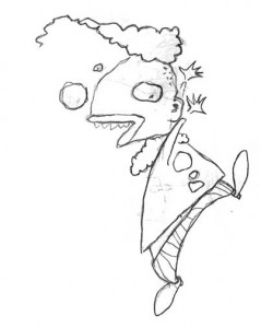 I just ran across a couple drafts for blog posts this morning, and realized they’ve been sitting around for over a year waiting to be posted. They each included a sketch of a clown without any other explanation. The first sketch hasn’t gone anywhere. I wasn’t very satisfied with it for some reason. I had planned on making a painting out of it, but it never materialized.
